Magneto has been working with top trial and commercial litigation law firm Markowitz Herbold Glade & Mehlhaf for over a year, creating an ongoing print ad campaign highlighting its talented team and unique company culture.
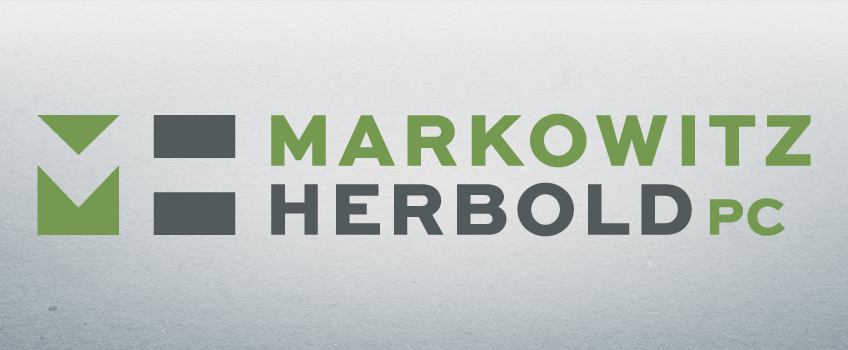
Recently, the #1 ranked commercial litigation firm in Oregon decided to return to their original founding name Markowitz Herbold, and called on Magneto to create a fresh new logo to reflect the shortened name.
We were given a few limitations from their marketing committee: No maroon, pink or purple and absolutely no bunny rabbits in the new design.
We think we did a pretty good job on following the rules.
The bold, graphic “M” and “H” are formed with simple rectangle and triangle shapes, adding a degree of whimsy around the new logo. The lively green and charcoal grey balance the serious nature of commercial litigation with the genial personality of the Markowitz Herbold team.
The new logo can be found on the Markowitz Herbold website, letterhead and other business collateral materials. Magneto also produced a graphic standards guide, offering logo variations, identifying typefaces and usage for web and print materials.
The new brand identity is symbolic of the continued evolution and growth of this extraordinary law firm. Congratulations, Markowitz Herbold!
The Markowitz rebrand is one of several rebrands Magneto has successfully facilitated over the past couple years. Thinking of rebranding your company? Feel free to contact Magneto for assistance.
Share:
Recent Posts
- 9/22/2016 • Magneto Creates M Financial’s 2015 Annual Report
- 8/03/2016 • Magneto aligns Marger Johnson’s look with the industries it serves
- 7/20/2016 • Magneto brings bold vision to City Color branding and website development
- 7/13/2016 • Brand Advertising, Defined: The Creative Process
- 5/25/2016 • Brand Advertising, Defined: Where Science Meets Art


