City Color has been in the business of printing and fabrication for over 30 years, specializing in retail environments for national clients like Nike and the Corner Bakery Café.
While this group of makers has spent years building an established reputation of accuracy and efficiency with its clients, City Color was lacking a website and brand identity to convey its detail-oriented work ethic.
Magneto was tapped to fill in the gaps and promptly got to work delving deep into the heart of the brand. Upon identifying City Color’s unique brand promise, Magneto turned its attention toward building a stunning visual identity.
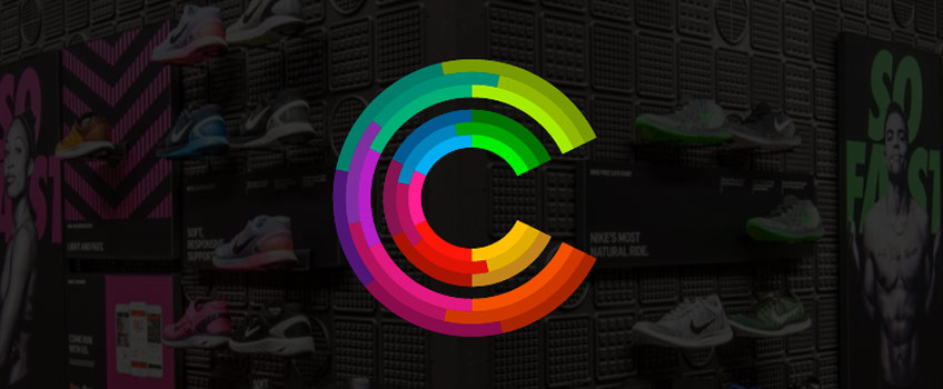
The logo we created is representative of the precision with which City Color collaborates to combine disparate elements into visually compelling work for its clients. The mark’s shape itself is simple, but its components call to mind the complex machinery of a clock’s inner workings—much like the meticulous nature of City Color’s creative process.
To further communicate City Color’s capabilities, Magneto developed a website using bold imagery and an eye-catching color palette worthy of its bold new logo. The sophisticated parallax design lets users scroll seamlessly from one image to the next, enabling City Color’s in-store displays to jump off the screen and speak for themselves. The website was built on a WordPress platform to support Google SEO.
Now that City Color is armed with its own bold brand identity, it can continue to serve its clients with the high-quality creative work that has become synonymous with its name.
You can check out the final product here.
Magneto has implemented branding and website development projects for a diverse roster of clients. Looking to brand or rebrand your business? Give us a shout—it’s kind of our thing.
Share:
Recent Posts
- 9/22/2016 • Magneto Creates M Financial’s 2015 Annual Report
- 8/03/2016 • Magneto aligns Marger Johnson’s look with the industries it serves
- 7/20/2016 • Magneto brings bold vision to City Color branding and website development
- 7/13/2016 • Brand Advertising, Defined: The Creative Process
- 5/25/2016 • Brand Advertising, Defined: Where Science Meets Art