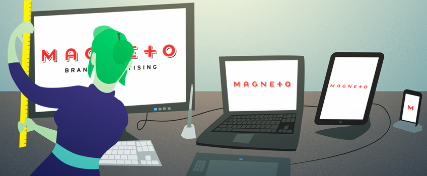
Responsive web design seems like a no-brainer these days, especially when it comes to mobile. Now that 90 percent of adults own cell phones, and 63 percent use them to access the Internet, it’s important for companies to have at least a basic mobile-responsive site to provide potential customers with information in a pinch.
Responsive web design is about crafting sites that provide an optimal viewing experience, witheasy reading and navigation, minimal resizing, panning and scrolling across a wide range of devices. Sites must be able to automatically fit and expand to any screen size to maximize readability and user experience. This is becoming increasingly important given the sheer number of devices and screen sizes that now exist in our plugged-in world. Regardless of device used, content should look like it was designed for that screen.
The Responsive Logos project is an experiment that plays with different logos at these different levels of “shrinkability.” For example, the Nike Air logo starts out with both a mark and wordmark. Shrink it once, it becomes “Nike” with its iconic swoosh. And then “Nke” and the swoosh. Finally, the logo becomes just the mark, identifiable at any size. Conventional wisdom says that good branding includes one logo, scalable to all sizes, but in an era when logos are displayed on semi trucks and pinky-nail-sized apps alike, perhaps there is merit to the idea.
Is this new incremental logo design the future of brand identity development? A logo could exist as three or more permutations depending on scale. And while we’re generally not proponents of multiple logo executions for a brand, within the multi-platform context, responsive design solves legibility issues while maintaining a brand’s identity. Hence, quality isn’t compromised merely because of a tiny screen. Having a logo hierarchy for use at different sizes allows for a more complex visual language, creating solutions for specific application problems rather than a one-size-fits-all approach. Certain elements that look elegant at large sizes, may be clumsy or unreadable as a thumbnail. With responsive logos, the compromises often made for small screen size are resolved.
What do you think about this potential new trend in logo design? Is it stretching a brand identity too thin or do you think it will help brands establish recall? Let us know @MagnetoAgency and check out our own take on responsive logos here – just resize your window!
Share:
Recent Posts
- 9/22/2016 • Magneto Creates M Financial’s 2015 Annual Report
- 8/03/2016 • Magneto aligns Marger Johnson’s look with the industries it serves
- 7/20/2016 • Magneto brings bold vision to City Color branding and website development
- 7/13/2016 • Brand Advertising, Defined: The Creative Process
- 5/25/2016 • Brand Advertising, Defined: Where Science Meets Art


